Blog

Jan 3, 2025
Interview for Zoë Law's Legends display.
I was recently interviewed as part of our involvement in Zoë Law's Legends display at the National Portrait Gallery.
Jun 14, 2024
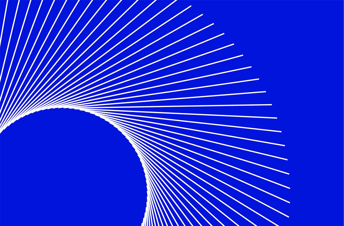
Spirals
Enjoyed working on these circular pattern designs which, sadly, were not used in the final branding project.
Apr 18, 2024
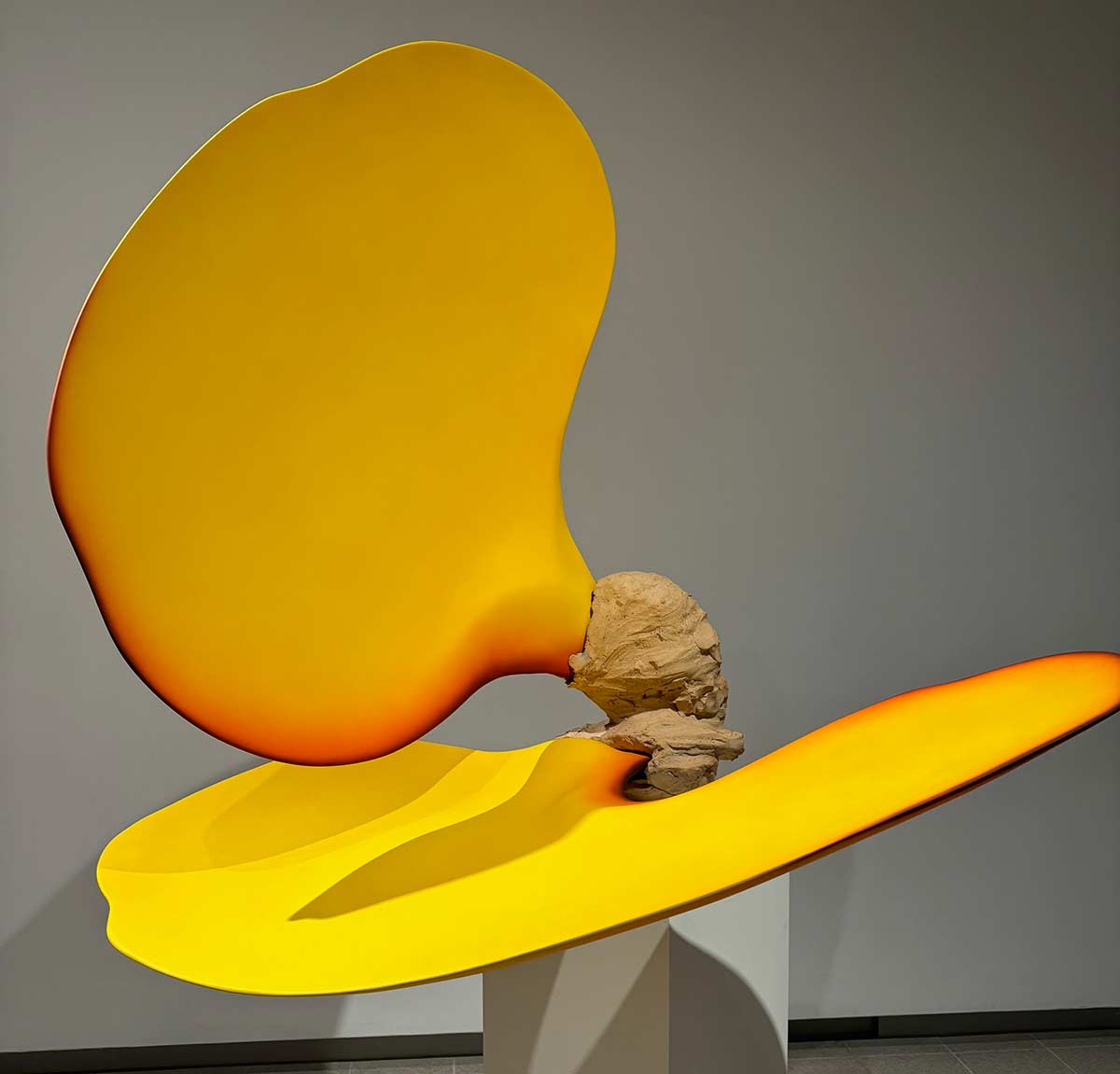
When Form Comes Alive
Loved this exhbition at the Hayward Gallery.

Nov 12, 2023
New work: Psychodrome
We recently developed the branding for Psychodrome - an experimental VR game breath as an input device...

Jun 5, 2023
Brighton design degree shows
The Brighton design degree shows are open this week, showing a huge range of design work from Graphic Design...

Jun 2, 2023
Most-seen work
We produced a logo for the British Parking Association many years ago (2005 and still being used!), and because it...

Nov 15, 2022
Lifeforms exhibition by Universal Everything
Very much enjoyed the Lifeforms exhibition just off The Strand recently. A series of 14 ‘generative pieces’, some of...

Nov 7, 2022
Dark Matter, Berlin
Recently back from a trip to Berlin we can very much recommend the Dark Matter installation. The seven pitch-black...

Nov 3, 2022
Award-winning logo design
We are delighted to hear that our logo design for GoGo Brazilian, the Brighton-based hot waxing company has been selected...

Aug 15, 2022
The photography of JP and Mike Andrews
Her’es a few examples of their beautifully simple, abstract aerial photography. The brothers developed their particular style...

Sep 14, 2021
Nursing Workforce Standards
We recently designed this document for The Royal College of Nursing. It was “created to explicitly set out what must happen...

May 25, 2021
Website illustrations by Claire Green
We are currently working on a website redesign for one of the UK’s largest trade unions. Having not historically worked with...

May 14, 2021
Guinness ‘welcome back’
Pre-empting the indoor opening of pubs next week, a lovely piece of work, further cementing it’s black and white shape as...

Apr 19, 2021
Kelsey Johnson – behind the scenes
Always a fan of behind the scenes – here is a series of location v shot images from Kelsey Johnson, a Seattle-based travel...

Apr 13, 2021
Award-winning branding for GoGo Brazilian
Thankfully the client took the brave steps to completely change their branding and it was an enlightening education into the...

Feb 17, 2021
Benjamin Shine’s sculptures from fabric
Some astonishing work from Benjamin Shine to produce these sculptures from fabric, using just a needle and thread, and an...

Nov 13, 2020
Great thinking to get into advertising
A really good example of doing something different to capture the attention. In this case the attention of some of the UK’s best...

Aug 19, 2020
The Tokyo toilet project
Designed by architect Shigeru Ban, these innovative public toilets form part of a project that providing redesigned facilities in...

Jul 6, 2020
Brighton Graphic Design Degree Show
Amongst all the other restrictions being faced around the country, it is a shame not to be able to visit the Brighton Degree...

May 6, 2020
The Westfjords Way
Whilst the future of international travel currently looks very uncertain, the stunning imagery of this dramatic region certainly...

Feb 24, 2020
Bob Mazzer’s photography
We were recently introduced to the work of Bob Mazzer, London-born photographer now residing on the south coast...

Jan 7, 2020
Coming alive after dark
An inspired bit of thinking from BBC Creative for this billboard design. What appear to be random wooden stakes thrust into ...

Dec 17, 2019
Bridget Riley
Always fan’s of her graphical work, this exhibition of Bridget Riley’s work over the past half century is a starting collection of...

Nov 27, 2019
Sports photography
Whilst working on a recent website design, we were introduced to the compelling photography work of Kathi Harman. Kathi...

Nov 15, 2019
Overlooked ‘street jewellery’
Manhole covers. Overlooked by so many, but so often their intricate patterns and history deserve a second life. And here...

Sep 24, 2019
Listen like you used to
A really engaging campaign for Spotify by London design agency Who Wot Why. It brilliantly taps into Spotify’s research which...

Aug 14, 2019
Loving branding for the wrong reasons
Apparently not. This is not the rationale behind the branding according to UnderConsideration – “The new logo is built around...

Aug 12, 2019
Pitches and previous work
We recently visited a potential client as part of their tender process for a new piece of work. When showing our design work to...

Jul 9, 2019
New project: Californian retailer
As a result of our previous work, we recently won some new business working on the design of a new ecommerce website for...

Jun 10, 2019
Brighton graphic design and fine art degree shows
We visited Brighton University last week to take a look at the design work of this year’s graduates. This heartfelt piece of...

May 28, 2019
Brighton designers re-purposing local plastic waste
Brighton startup design studio Gomi have taken ‘non-reclyclable’ plastic waste from local Brighton businesses and developed...

Apr 17, 2019
Extinction Rebellion logo design
A great piece of logo design forms the centrepiece of the Extinction Rebellion movement’s visual identity. Reminiscent of other...

Apr 4, 2019
The post-truth business
“Brands are built on trust, but in a post-truth world they’re faced with a serious challenge: so much of modern life is defined by...

Mar 18, 2019
atelier75 – SS19
Some nice photography by Alex Webb just added to our client atelier 75’s website for their SS19 collection.

Mar 13, 2019
Olympic inspired airport design
With a nod to the forthcoming 2020 Toyko Olympics, the Japanese design agency Party has come up with a novel approach...

Mar 4, 2019
Don McCullin at Tate Britain
The Tate Britain is currently showing a major retrospective of the work of the photographer Don McCullin. A vast collection of...

Feb 12, 2019
Stephen Jones bring his radical hats to the Royal Pavilion.
For the next few months, Brighton’s Royal Pavilion will host an exhibition of hats by the miliner Stephen Jones OBE. In part set...

Feb 8, 2019
McDonald’s advertising by Guy Moore
Some lovely simple visuals for McDonald’s mobile ads by Canadian Creative Director Guy Moore. Not the first beautifully...

Feb 4, 2019
Paper engineering and science
Some astounding work from paper engineer Matt Schlian. Hard to believe that some of these pieces are made solely by...

Jan 1, 2019
Grey leads the way
Our design work frequently uses a range of greys alongside brand colours. As long-serving advocates, we were interested to...

Oct 11, 2018
Photography: behind the scenes
Another behind-the-scenes video. This time showing the work of London-based, Australian photographer Wilson Hennessy...

Sep 30, 2018
Behind the scenes of one of the new BBC2 idents
The BBC2 idents over the years have always brought a fun, slightly irreverent, interlude to programmes. They have gradually...

Jul 5, 2018
New project: web design for atelier 75
On the strength of our existing work in the online fashion retail sector, we are delighted to have been approached by atelier 75...

Feb 22, 2018
New project: Northlight
We are delighted to have been approached by London-based investment management firm Northlight to design a new...

Jun 17, 2017
New project: branding for Mackenzie Thorpe
We recently me up with the Artist Mackenzie Thorpe to discuss working on a branding and design project. Although hailing...

Sep 3, 2016
Rebranding or retro branding
There has been a great amount of coverage recently for the re-branding of the Co-op. Literally re-branding, in bringing back...

May 6, 2016
London underground real time 3D map
Some astounding interactive work from Bruno Imbrizi. Watch and move around a real time 3D map of the London...

Jan 21, 2016
100 years of the Royal College of Nursing
We recently designed an update for the RCN’s Bulletin – sent out to over 400,000 nursing staff throughout the UK. Here it is...

Nov 4, 2013
New studio for the business
We are very pleased to announce that Mark Design has now bought 4 Orange Row (where?), in the centre of Brighton’s North Laine.

Mar 15, 2022
Beautifully simply C&P logo by DutchScot
This is a particularly lovely piece of design. That two characters can come together so beautifully to create a third is the kind...

Nov 1, 2021
The playful photography of Anna Devís and Daniel Rueda
A recent Guardian article featured these two Spanish photographers’ work. Together they produce these graphically simple...