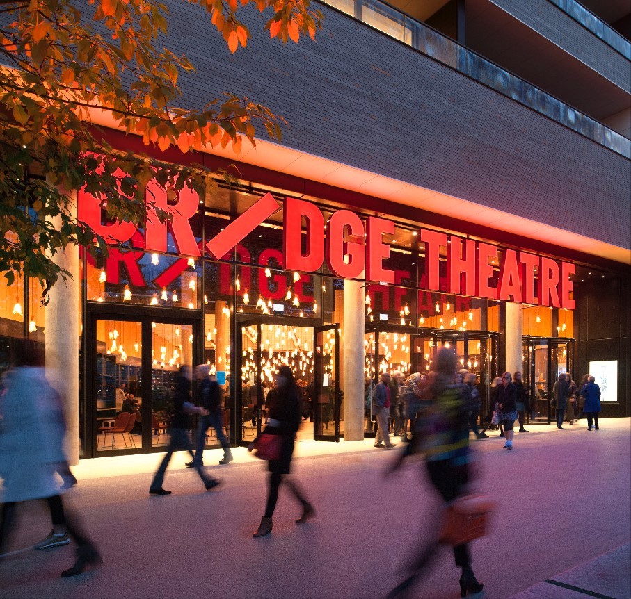
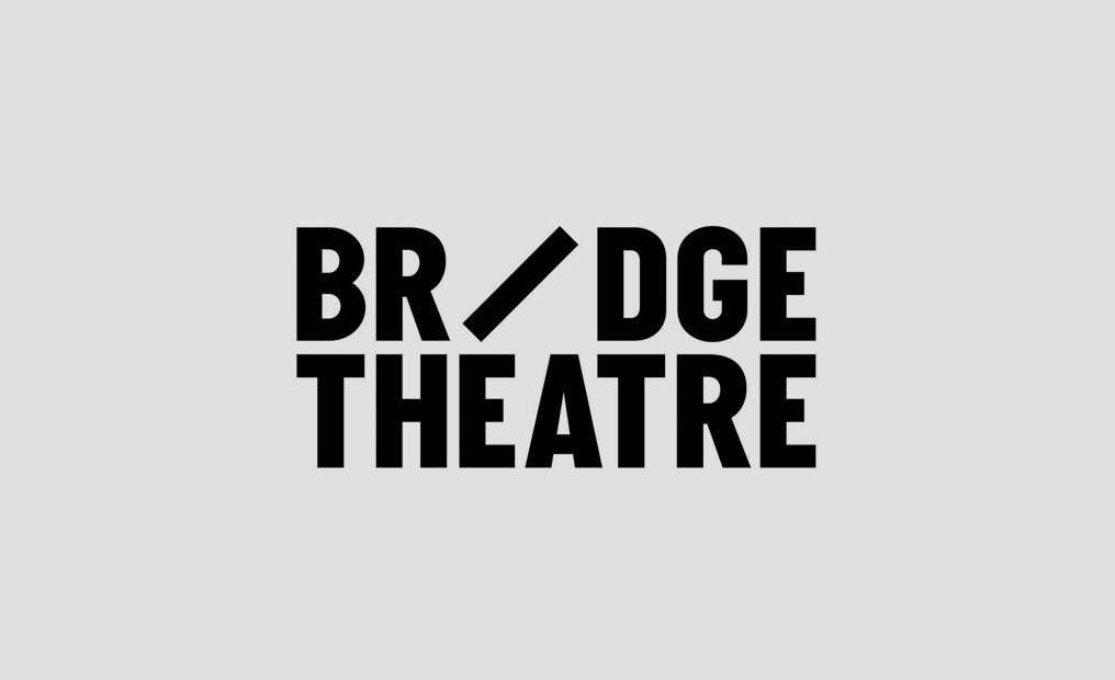
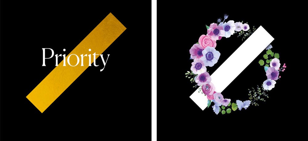
Apparently not. This is not the rationale behind the branding according to UnderConsideration – “The new logo is built around a simple icon we call ‘Beam’. Named after a piece of theatre lighting terminology, this bridge like mechanic stays static in position, across logo formats, and becomes the instant icon at the centre of the whole identity.”